Bootstrap Table | Responsive, Hoverable, Borderless, & Sorting, Searching, Paging using DataTable.js
Get different types of bootstrap table classes with editable live code. These Examples are Simple tables,
Responsive, Sticky Header, Borderless, and so on. & You can also find code of Pagination, Searching, and Sorting
using datatable.js. Here in this Bootstrap Table Example, you can design any responsive table feature with
column width, scroll vertical, round corner header, condensed table, hover rows, and dark background table. Not
only this, you can make Bootstrap table active, contextual classes, borderless, table with a fixed header, and
add an icon in the table. The Bootstrap data table with pagination, sort, and search. Make Responsive Bootstrap
Table with Pagination Text Added Dynamically. Every table is editable and the code can be copied. You can use
these tables in Bootstrap 5, Bootstrap 4, and Bootstrap 3 versions.
Bootstrap Table: Basic example & tutorial
The Simple/Basic bootstrap table is made by add the .table class in the tag of the HTML code i.e
<table class="table">. It consists of light padding and horizontal partitions. We can also add some CSS styles
like border color, background color, and so on to the table to make it look more attractive. The Basic table
looks like in Bootstrap given below.
Bootstrap table: Contextual classes of table in Bootstrap
The Bootstrap table allows to the addition of contextual classes that can replace the color of entire tables
or single rows as well as single column by applying classes. such as .table-light in the the
<table> tag ,<tr> tag or <td> tag. i.e
code look like <table class="table-light">, <tr class="table-primary">,
<td class="table-dark">.
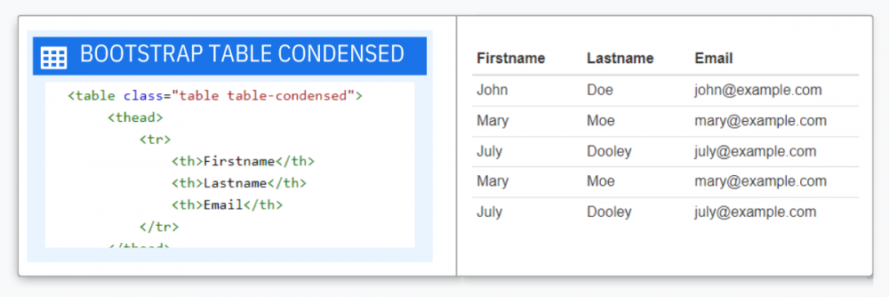
Bootstrap table-condensed class
Bootstrap table condensed means to cut the cells of padding in half or make compress by decreasing the height.
For adding condensed table characteristics in the bootstrap table. .table-condensed class is used
in the
<table> tag. i.e the table tag code looks like
<table class="table-condensed">Some content </table>.
Bootstrap table-hover Class
Bootstrap hover table refers to adding hover functionality to the table.
For table hover in bootstrap table we have to add .table-hover class in
<table> tag. i.e the code look like <table class="table-hover">some
content </table>
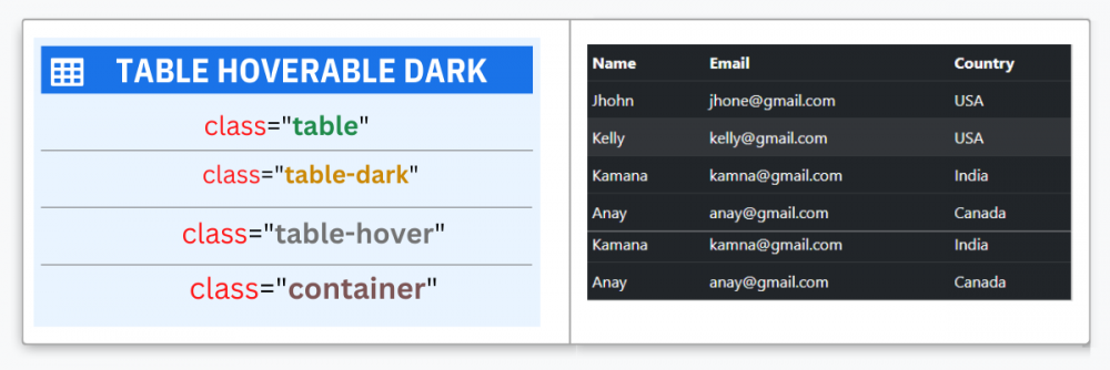
Bootstrap Dark Table with Hoverable Rows
Bootstrap dark hoverable table refers to adding hover functionality to a row with the dark background of the
table. for adding dark background .table-dark class is used and for hover .table-hover classes are used to add
the hover effect (change background color to dark gray when the mouse moves over) on table rows. Use the mixture
of the table, table-dark, and table-hover classes within the
<table> tag to make the dark hover effect table. The code looks like <table class="table table-dark table-hover">some content...</table>
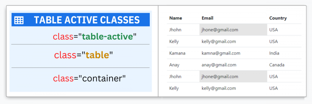
table-active class | Bootstrap , HTML , CSS
Bootstrap active table class refers to highlighting table row or cell by adding .table-active class to the
<table> tag, <tr> tag, <td> tag . The code looks like <table class="table-active">,<tr class="table-active">,<td class="table-active">. You can use table-active
source code or live edit code. and You can copy the code and paste it into your project.
Bootstrap Border Table Class | Code | Example
Bootstrap border table refers to adding borders to the entire table.
For implementation, .table-bordered class is used in the <table> tag for borders around the
table and cells. i.e the code look like
<table class="table-bordered">some content </table> .
You can use table-bordered source code or live edit code. and You can also copy code and paste it into your
project.
Apply Bootstrap Table Border Color Code
Bootstrap border-color class refers to adding borders within a different types of color like
primary-color(#0d6efd) , secondary-color(#6c757d) , success-color(#198754) , danger-color(#dc3545) , warning-color(#ffc107) , info-color(#0dcaf0) , light-color(#f8f9fa) , dark-color(#212529).
for the implementation of the border color in the bootstrap table by adding a combination of classes like
.table-bordered and .border-primary in the table tag and the code look like
<table class="table table-bordered border-primary">some content </table>.
you can use these classes also in <table> tag, <tr> tag or <td>tag:
The classes are: .border-primary , .border-secondary , .border-danger , .border-info , .border-warning ,
.border-active , .border-success , .border-light , .border-dark
Bootstrap Borderless Table Code
Bootstrap Borderless table: To construct the table borderless add the class .table-borderless within the
.table class in
<table> tag. the code looks <table class="table table-borderless">some content</table>. We can also create a dark
table without a border by adding a combination of classes .table-borderless & .table-dark in the table tag
that removes all side borders with the dark background of the bootstrap table. sample code is <table
class="table table-dark table-borderless"> some content</table>
Bootstrap Table Borderless with Dark Background
The .table-borderless & .table-dark classes are used for remove all side border
with dark background of bootstrap table
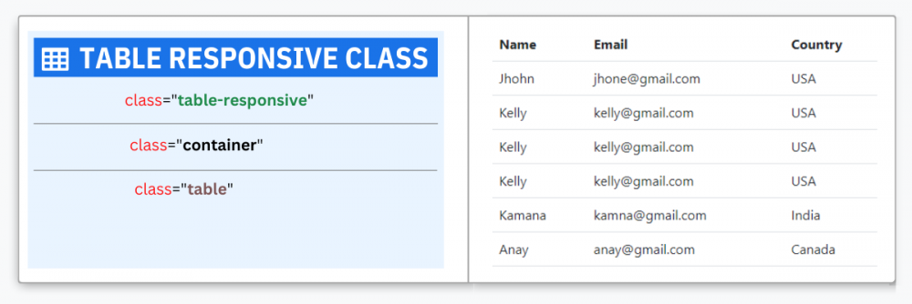
Bootstrap table Responsive example & tutorial
Bootstrap Responsive table refers to set tables to be scrolled horizontally. Construct any table
responsive
across overall viewports by a combination of class .table with .table-responsive. i.e
<div class="table-responsive">
<table class="table"></table>
</div>You can also identify when the table should have a scrollbar, based on the viewport
width (i.e. breakpoints),
using the classes .table-responsive-sm {width>576px} ,
.table-responsive-md {width>768px} ,
.table-responsive-lg {width>992px} , .table-responsive-xl
{width>1200px}. From that breakpoint, the table works well
and does not slide horizontally. The demo code is <div class="table-responsive-md">
<table class="table"></table>
</div>
Bootstrap Table Rounded Corners Header refers to implement
border-radius CSS property rounds the corners of an element's outer border radius to a table heading. we have to add some style like border-radius & overflow, so we added class .bdr in <table> tag for border-radius and .bg-red class added in <thead> tag for background color. so the code looks like this,<table class=" table bdr"><thead class="bg-red"></thead></table>.
we can also use Bootstrap class border-radius i.e .rounded
Dynamically add/remove row using Bootstrap &
Jquery
Dynamically add/remove table row using Jquery with bootstrap refers to Initially, the table is empty and has no
rows. on clicking add row button it's initialized by dynamically adding rows to the body of the table and seeing
how to remove rows from the table. the sample code is given below you can copy the code or live to edit the code
using the code editor. This sample code will help you to paste the code of your project and to start to use
Dynamically Add and Remove HTML Table Rows using JavaScript and jQuery with bootstrap. This front-end feature
...

Bootstrap table with fixed header refers to table header which is fixed on top and body scroll
vertically i.e Table at the top with a long list of columns and a sticky header, for implementation, we have to
add a combination of class .sticky-top and top-0 in <thead> tag.the sample code
looks like this <table
class="table">
<thead class="sticky-top top-0"></thead>
</table>.you can use preview and copy code code from given below in the editor.
Bootstrap Striped Table with Button Icon refers to providing zebra strips with a bootstrap button icon,
The .table-striped class adds zebra stripes to a table column. For implementation, we have to use a combination of
classes .table-striped, .table-responsive and bootstrap icon CDN. so the sample code looks like this
<div class="table-responsive">
<table class="table table-striped">></table>
</div>.you can see preview and copy code code from given below in the editor.
Bootstrap Table makes Pagination if we added text
dynamically,
This example shows a single row, when we added text after the five rows it dynamically create pagination. you can
use the editor for live preview and edit the code.
for Implantation of this pagination table in your project:
Step 1: Include the jQuery & Bootstrap CDN in <head> tag·
Step 2: Copy HTML code, Paste in your <body> tag ·
Step 3: Copy javascript code and paste it <script> tag
Bootstrap table with pagination refers to Pagination as an easy navigation approach that divides a
large amount of content within your tables cut into small pages. By default, pagination is added with the Previous,
page numbers, and Next buttons. To handle the table pagination we can use one of the options given below. you have
also the choice to show the number of columns on each page by selecting "no. of rows".
Bootstrap Table with Sorting, Searching, Paging using
DataTables
Bootstrap Table with Sorting, Searching, and Paging refers to DataTable.js directly giving column searching,
sorting, and pagination
for implement a sorting data table using bootstrap and a few JavaScript libraries. The
table rows will be sorted by clicking on the column headers. It has a pagination characteristic also, so if a
user select 10 rows and the table has 50 rows, then each page shows only 10 rows remaining rows will add to the
next page. In this example, the table id is 'example'
then Js code is <script>
$(document).ready(function() {
$('#example').DataTable();
});
</script>.
This integration is done simply by including the DataTables Bootstrap file (CSS and JS).
This example shows the data table in responsive using bootstrap. and The datatable.js automatically deliver
column sorting, searching, and pagination...

Bootstrap 5 Table CDN
If you don't want to download and install Bootstrap 5 yourself, you can add it from a CDN (Content Delivery
Network).
copy
<!-- Latest compiled and minified CSS -->
<link href="https://cdn.jsdelivr.net/npm/[email protected]/dist/css/bootstrap.min.css" rel="stylesheet">

<!-- Latest compiled JavaScript -->
<script src="https://cdn.jsdelivr.net/npm/[email protected]/dist/js/bootstrap.bundle.min.js"></script>
Bootstrap 4 Table CDN
If you don't want to download and install Bootstrap 4 yourself, you can add it from a CDN (Content Delivery
Network).
copy
<!-- Latest compiled and minified CSS -->
<link rel="stylesheet" href="https://cdn.jsdelivr.net/npm/[email protected]/dist/css/bootstrap.min.css">

<!-- jQuery library -->
<script src="https://cdn.jsdelivr.net/npm/[email protected]/dist/jquery.slim.min.js">

<!-- Popper JS -->
<script src="https://cdn.jsdelivr.net/npm/[email protected]/dist/umd/popper.min.js"></script>

<!-- Latest compiled JavaScript -->
<script src="https://cdn.jsdelivr.net/npm/[email protected]/dist/js/bootstrap.bundle.min.js"></script>
Bootstrap 3 Table CDN
If you don't want to download and install Bootstrap 3 yourself, you can add it from a CDN (Content Delivery
Network).
copy
<!-- Latest compiled and minified CSS -->
<link rel="stylesheet" href="https://maxcdn.bootstrapcdn.com/bootstrap/3.4.1/css/bootstrap.min.css">

<!-- jQuery library -->
<script src="https://ajax.googleapis.com/ajax/libs/jquery/3.6.0/jquery.min.js"></script>

<!-- Latest compiled JavaScript -->
<script src="https://maxcdn.bootstrapcdn.com/bootstrap/3.4.1/js/bootstrap.min.js"></script>
Bootstrap Table FAQs
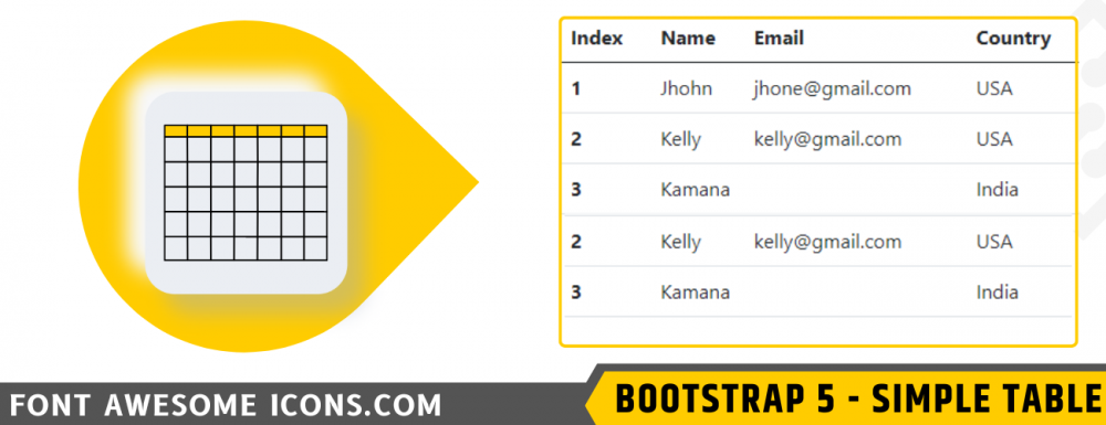
⭐How to get unique Bootstrap Table examples?
Here you can get 18 different unique bootstrap table examples. These tables are responsive and have features of
search, sort, and pagination.
⭐What is a Responsive Bootstrap Table?
The responsive table is about creating a good table on all devices. A responsive table will automatically adjust
for
different screen sizes and viewports
⭐What is the difference between Bootstrap Table with search and Bootstrap table with pagination?
Bootstrap Table with search means Super fast and easy-to-use searching the data to our tables whereas Bootstrap
table
with pagination means is built with list HTML elements so screen readers can announce the number of available
links.
⭐What is Bootstrap Table with sorting and search mean?
Bootstrap Table with sorting functionality allows you to sort the data of the tables according to any specific
columns and search the data
⭐What is Bootstrap Table with pagination and search mean?
Bootstrap table with pagination and search mean table provides multiple pages and search bar
⭐What is a responsive Bootstrap Table with pagination?
Responsive Bootstrap Table with pagination means will automatically adjust for different screen sizes and
viewports
with the multiple pages
⭐What is a Bootstrap Table column width, sorting, and scroll?
Bootstrap column width means to change the width of a table, sorting functionality allows you to sort the data of
the
tables according to any specific columns scroll means to scroll the table.


