Search Results
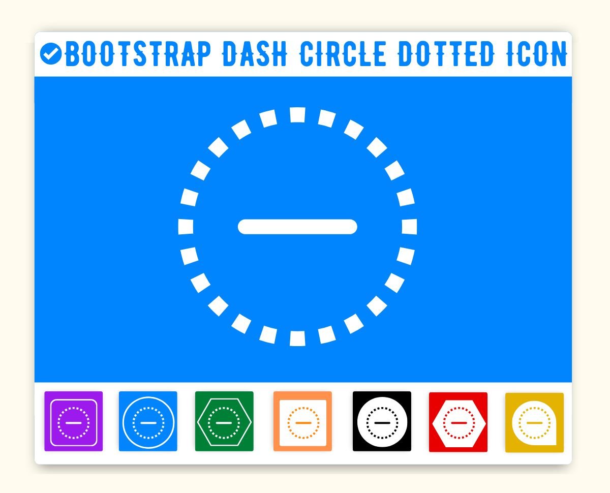
Bootstrap Dash Circle Dotted Icon (Minus)
Dash circle dotted Icon is given below. You can use this icon on the same way in your project. First make sure you have added Bootstrap Icon library. If this library is added just add the HTML css class dash-circle-dotted to any element to add the icon. Bootstrap dash circle dotted Icon can be resized as per your need. You can manage size of icon(dash circle dotted) by using font-size css style.
You can get steps to add HTML icon Dash circle dotted in Web, Bootstrap and Angular Bootstrap framwork.
How to add Bootstrap dash circle dotted Icon ?
Bootstrap Icon dash circle dotted Icon can be added to any web page simply as below.
Icon Code-
Dash circle dotted Icon Code | Customize color
You can get icon dash circle dotted in blue, white, red color and transparent color from below list. You can also customize color using color picker.
Advance Editor
Size
Opacity
Stroke
1. Web
You can integrate Icon in web pages by just adding following below syntax & icon code.
Bootstrap Button with dash circle dotted Icon
Button Icon Left -
You can add icon to button left aligned as below.
<button type="button" class="btn btn-primary"><span class="bi bi-dash-circle-dotted"></span> Sample Button</button>Button Icon Right -
You can add icon to button right aligned as below.
<button type="button" class="btn btn-primary">Sample Button <span class="bi bi-dash-circle-dotted"></span></button>Icon Button -
If you want to make button icon only and no text, add following code.
Icon Button Link-
Icon link button can be created simply as below.
Tags
beat ,fling ,hurtle ,dab ,droplet ,round,Bootstrap Minus Icon
Bootstrap Icon dash circle dotted Icon | dash circle dotted | HTML, CSS
Adding Bootstrap Icon icon HTML Dash circle dotted(dash-circle-dotted) in web project is very simple. You need to add the icon class along with bi, it is basically main class and mandatory for icons so do not forget to add this class. You can customize Bootstrap Icon dash circle dotted Icon Dash circle dotted as per your requirement, suppose that you need to chnage the color of Dash circle dotted icon or change the size of size. It is pretty simple to change color of icon Dash circle dotted just add style="color:red" it will make font color red. On the same way you can change size of Dash circle dotted icon by just adding style="font-size:50px;". Smililarly you can add border color, shadow and other font styles to Dash circle dotted. Hope this icon fullfilled your need.
Change Bootstrap Icon Icon Dash circle dotted Color
Sometimes we need icons in different color, as we suggested by adding css style we can change color. Here we have created one example to change color of icons with css classes.
    <style>

    .blue-color {

        color:blue;

    }


    .green-color {

        color:green;

    }


    .teal-color {

        color:teal;

    }


    .yellow-color {

    color:yellow;

    }


    .red-color {

        color:red;

    }

   </style>


    <span class="bi bi-dash-circle-dotted blue-color"> </span>

    <span class="bi bi-dash-circle-dotted green-color"> </span>

    <span class="bi bi-dash-circle-dotted teal-color"> </span>

    <span class="bi bi-dash-circle-dotted yellow-color"> </span>

    <span class="bi bi-dash-circle-dotted red-color"> </span>
Output of the above example will be as below-
<link rel="stylesheet" href="https://cdn.jsdelivr.net/npm/[email protected]/font/bootstrap-icons.css"> Advertisements
Advertisements