Search Results
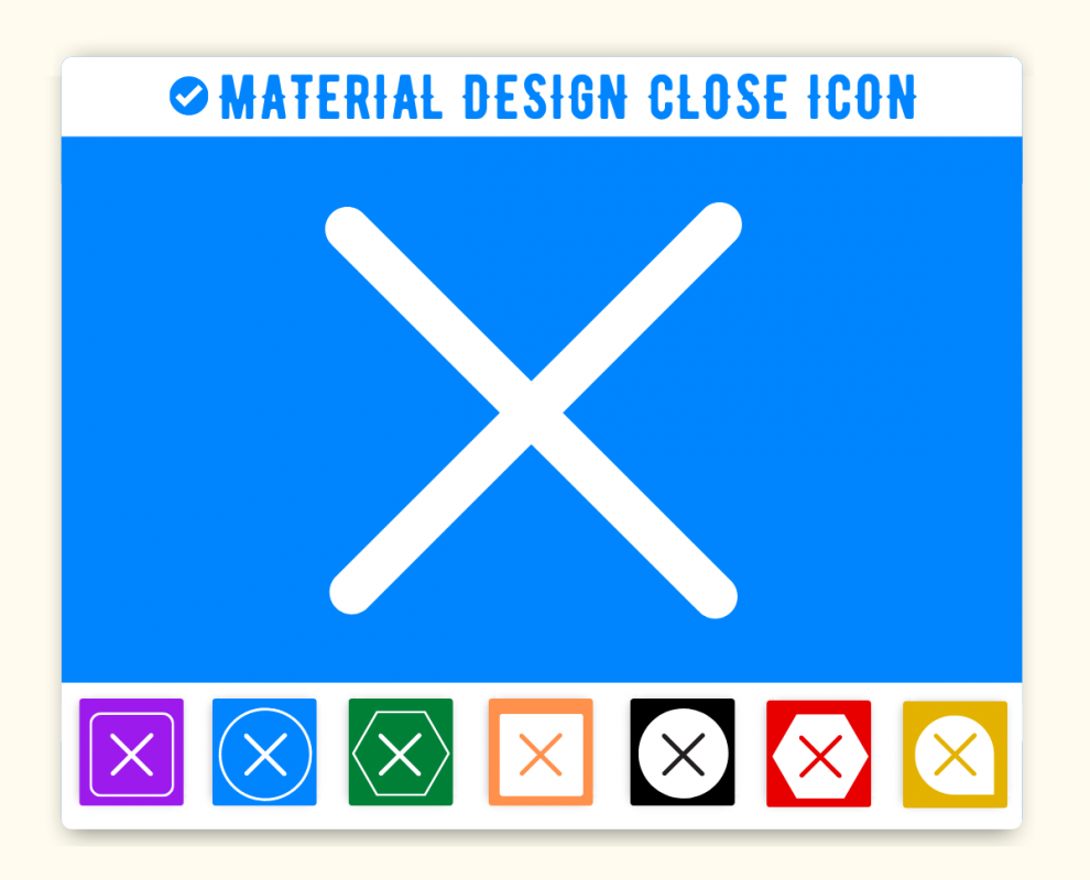
Material Design Close Icon
Close Icon is given below. You can use this icon on the same way in your project. First make sure you have added Material Icon library. If this library is added just add the HTML css class close to any element to add the icon. Material Design Close Icon can be resized as per your need. You can manage size of icon(close) by using font-size css style.
You can get steps to add HTML icon Close in Web, Vuetify, Material UI, Material Design and Angular Material framwork.
How to add Material Design Close Icon ?
Material Icon close Icon can be added to any web page simply as below.
1. Web
You can integrate Icon in web pages by just adding following below syntax & icon code.
Close
Icon
<span class='material-icons-outlined'>close</span> Code
close Close
Icon
<span class='material-icons'>close</span> Code
close Close
Icon
<span class='material-icons-round'>close</span> Code
close Close
Icon
<span class='material-icons-sharp'>close</span> Code
close Close
Icon
<span class='material-icons-two-tone'>close</span> Code
close 2. Vuetify Icon Close
You can add icon in vuetify(VueJS) material design framework just as below-
3. Material Ui Icon Close - React
You can add icon in MaterialUi react framework just as below-
3. Angular Material Icon Close - mat-icon
You can add mat icon Angular Material in Angular Material framework by just adding below code-
Tags
cancel, close, exit, stop, x,Vuetify Close Icon (Vue Js), Material Ui Close Icon (React Js), Mat Icon Close (Angular Material)
Material Icon Close Icon | close | HTML, CSS
Adding Material Icon icon HTML Close(close) in web project is very simple. You need to add the icon class along with material-icons, it is basically main class and mandatory for icons so do not forget to add this class. You can customize Material Icon Close Icon Close as per your requirement, suppose that you need to chnage the color of Close icon or change the size of size. It is pretty simple to change color of icon Close just add style="color:red" it will make font color red. On the same way you can change size of Close icon by just adding style="font-size:50px;". Smililarly you can add border color, shadow and other font styles to Close. Hope this icon fullfilled your need. Thanks for visiting us.
Change Material Icon Icon Close Color
Sometimes we need icons in different color, as we suggested by adding css style we can change color. Here we have created one example to change color of icons with css classes.
    <style>

    .blue-color {

        color:blue;

    }


    .green-color {

        color:green;

    }


    .teal-color {

        color:teal;

    }


    .yellow-color {

    color:yellow;

    }


    .red-color {

        color:red;

    }

   </style>


    <span class="material-icons blue-color"> close</span>

    <span class="material-icons green-color">close </span>

    <span class="material-icons teal-color"> close</span>

    <span class="material-icons yellow-color">close </span>

    <span class="material-icons red-color">close </span>
Output of the above example will be as below-
<link href="https://fonts.googleapis.com/icon?family=Material+Icons" rel="stylesheet">
Advertisements
Advertisements