Bootstrap Alerts Example
Bootstrap Alerts:Bootstrap Alerts are user interface components that provide feedback to users based on their actions. A Simple Alert is a basic notification box with customizable content and styling. Dismiss Alerts Using Data Attributes allow users to close alerts by clicking an "X" button, enhancing user experience. Alerts with Icons include visual cues like icons to convey information effectively, making them more informative and engaging. These versatile Bootstrap features enhance web design by offering customizable, user-friendly alerts for better communication and user interaction.


Thanks for your feedback!
Your contributions will help us to improve service.
How can I create a simple alert using Bootstrap?
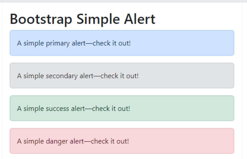
To create a basic alert using Bootstrap, include the Bootstrap CSS and JavaScript libraries in your HTML file. Then, use the <div> element with the class "alert" and additional classes like "alert-success," "alert-warning," or "alert-danger" for different styles. Inside the div, place your message text. Example: <div class="alert alert-success">This is a success message.</div>. This code generates a simple, styled alert conveying information to users. Customize the classes and content to display success, warning, or error messages based on your needs.
Output of Bootstrap Simple Alert
How can data attributes be used to implement Bootstrap dismissable alerts?
Data attributes can implement Bootstrap dismissable alerts by assigning them to alert elements. For example, using "data-dismiss" with the value "alert" on a button or link allows it to close the associated alert when clicked. Data attributes like "data-bs-toggle" and "data-bs-dismiss" are used to control Bootstrap's alert functionality, enabling users to dismiss alerts interactively by clicking designated elements, enhancing user experience.
Output of Bootstrap Dismiss Alerts Using Data Attributes

How can I create a Bootstrap alert with an icon?
To create Bootstrap alerts with icons, use the alert and d-flex classes for styling, and include an SVG icon along with your alert message. The icon is placed using the flex-shrink-0 me-2 classes. Each alert has a different color class like alert-primary, alert-success, alert-warning, or alert-danger to define its style. The SVG element contains the icon while the accompanying <div> holds the alert message. This combination ensures that each alert displays an icon alongside its message. You can customize the icon and message content as needed for various types of alerts.
Output of Bootstrap Alert with Icon