Bootstrap Modal Example
Bootstrap Modal Example: Bootstrap Modal provides various size options, enabling flexible content presentation. 'Fullscreen' expands the modal to cover the entire viewport, ideal for immersive experiences. 'Small' and 'Large' options allow tailored sizes for content, ensuring a snug fit. 'Extra Large' is suitable for extensive content, preventing overcrowding. These size classes enhance user experience by accommodating diverse content needs within a sleek, responsive interface, a hallmark of Bootstrap's utility in web development.


Thanks for your feedback!
Your contributions will help us to improve service.
How can I create a fullscreen modal using Bootstrap?
The "modal-fullscreen" class in Bootstrap is used to make a modal dialog occupy the entire width of the viewport, creating a fullscreen modal. This class sets the modal's width to match the width of the user's screen, ensuring that the modal takes up the entire available horizontal space.
Output of Bootstrap Fullscreen Modal

What is the syntax for creating a small-sized Bootstrap Modal?
The Bootstrap Modal class "modal-sm" reduces the width of a modal dialog, making it smaller and more compact. This is useful when you want to display concise content or notifications without occupying too much screen space. By applying this class, you can create a small, space-efficient modal window that is particularly handy for displaying quick messages, alerts, or small forms while ensuring a clean and unobtrusive user interface.
Output of Bootstrap Modal Small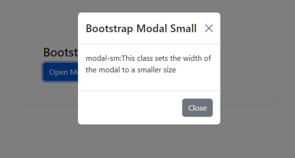
How can I create a large-sized modal using Bootstrap's modal component?
The Bootstrap class "modal-lg" is used to enlarge the width of a modal dialog box in web development. By applying this class, the modal expands to a larger size, providing more space for content or displaying larger elements. This is particularly useful when you need to showcase extensive information, images, or forms within the modal while maintaining a responsive and user-friendly design
Output of Bootstrap Modal Large

What is the procedure for creating an extra large Bootstrap Modal?
The Bootstrap class "modal-xl" is used to enlarge the width of a modal dialog in web development. By applying this class, the modal becomes extra-large, providing more space for content and improving user experience.
Output of Bootstrap Modal Extra Large
